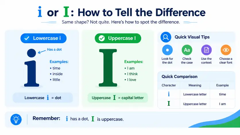
“i or l” refers to the common confusion between the lowercase letter i and the lowercase letter l, which can look very similar in some fonts. The easiest way to tell them apart is that lowercase i normally has a dot, while lowercase l usually has no dot.
This confusion is common when reading usernames, passwords, website addresses, serial numbers, codes, screenshots, and small digital text.
The problem becomes even harder when uppercase I and the number 1 are also present, as all four characters can look similar in certain typefaces.
Knowing the difference helps prevent simple but frustrating typing and reading mistakes. While i and l are completely different letters with different roles in English, their visual appearance can sometimes cause uncertainty.
In this guide, you will learn how to identify i or l, understand their meanings and origins, avoid common mistakes, and recognize the difference between i, l, I, and 1 in everyday writing.
i or l: Quick Answer
The simplest way to distinguish i or l is to look for the dot and the character’s shape.
- i = lowercase letter i, usually with a dot
- l = lowercase letter L, usually without a dot
- I = uppercase letter I
- 1 = number one
For example:
- i appears in time
- l appears in light
- I appears in I am ready
- 1 appears in 21
If the font makes the characters difficult to identify, look at the complete word or surrounding text. Context often makes the correct character obvious.
What Does i or l Mean?
“i or l” is not a specific English phrase with its own dictionary meaning. It is a search phrase people use when they cannot tell if a character is a lowercase i or a lowercase l.
This problem is especially common when characters appear in a simple font.
What Does i Mean?
The lowercase i is the ninth letter of the English alphabet. It is a vowel and appears in many common English words.
Examples include:
- sit
- fish
- time
- write
- little
- inside
The pronunciation of i changes depending on the word. For example, the i has a short vowel sound in sit, while it represents a long vowel sound in time.
The lowercase i normally has a dot above its main vertical stroke.
What Does l Mean?
The lowercase l is the twelfth letter of the English alphabet. It is a consonant.
Examples include:
- light
- look
- long
- little
- school
- blue
Unlike lowercase i, lowercase l normally does not have a dot.
What Does Uppercase I Mean?
I is the uppercase form of the letter i.
It is used in several situations, including the first-person pronoun:
I am learning English.
It is also used when a word beginning with i is capitalized.
The exact appearance of uppercase I depends on the font. Some fonts give it horizontal strokes at the top and bottom, making it easy to distinguish from lowercase l.
Why Do i and l Look Similar?
The main reason is font design.
Some fonts represent lowercase l as a very simple vertical line. Lowercase i also has a vertical body, so the two characters can look almost identical when the dot is small or difficult to see.
The problem becomes worse when:
- Text is very small.
- An image is blurry.
- A screenshot has low resolution.
- A decorative font is used.
- Characters appear in a short code.
- The text is displayed on a small screen.
The Origin of i and l
The letters i and l both belong to the Latin alphabet, but they have separate histories.
The letter i developed through the history of the Latin writing system. In lowercase writing, scribes eventually used a dot above the letter to make i easier to recognize, especially when several vertical strokes appeared next to each other.
The letter l also comes from the Latin alphabet and has a long history as a distinct letter. Its basic form developed separately from i.
The similarity we see today is therefore mostly a typographic issue. Modern fonts can make two historically different letters appear visually similar.
The dot on lowercase i is one of the most useful visual clues readers have today.
British English vs American English
There is no major spelling difference between British English and American English when it comes to i, l, or I.
| Character | British English | American English | Example |
| i | Same | Same | time |
| l | Same | Same | light |
| I | Same | Same | I am ready. |
| 1 | Same number | Same number | 21 |
The confusion is usually caused by the typeface rather than regional English.
A British writer and an American writer use the same letters in words such as little, light, and inside. However, the visual appearance of those letters can change when a different font is used.
Font Differences
Some fonts make lowercase l very simple:
l
Other fonts add a curve or tail:
ℓ
Likewise, uppercase I may look like:
I
or it may have additional horizontal strokes.
This is why the same text can be easy to read in one font and confusing in another.
Publishing Preferences
Professional publishers, websites, and software interfaces often choose fonts that make similar characters easier to distinguish.
This is especially important for:
- Usernames
- Passwords
- Product codes
- Serial numbers
- URLs
- Account numbers
- Technical documentation
Which Version Should You Use?
You should not choose between i and l based on preference. The correct character depends on the word or information you are writing.
United States
Use the character required by the spelling of the word.
For example:
- little
- light
- inside
- time
Do not replace l with i simply because they look similar.
United Kingdom
The same basic rule applies. British English does not use a different version of the letters.
For example:
- little contains l and i
- light begins with l
- inside begins with i
Canada
Canadian English also uses i, l, and I according to standard English spelling and capitalization.
Australia
Australian English follows the same basic distinction.
The spelling of a word determines which character should be used.
International Writing
If you are writing for an international audience, use a clear and readable font.
This is particularly useful for:
- Website addresses
- Login details
- Reference numbers
- Product codes
- Technical documents
Academic Writing
Academic writing requires accurate spelling and clear typography.
If your work includes technical identifiers, make sure i, l, I, and 1 can be distinguished easily.
Business Writing
Business documents should prioritize clarity.
A confusing font can cause mistakes in:
- Invoice numbers
- Customer references
- Email addresses
- Account information
- Product numbers
Common Mistakes
Confusing lowercase i with lowercase l
Incorrect: iight
Correct: light
The first character in light is lowercase l, not lowercase i.
Memory tip: i has a dot; l does not.
Confusing lowercase l with uppercase I
Incorrect: l am ready.
Correct: I am ready.
The first-person pronoun is always written as uppercase I in standard English.
Memory tip: When you mean yourself as the speaker, use I.
Confusing i with the number 1
These are three different characters:
- i = lowercase letter
- l = lowercase letter
- 1 = number
For example:
- ill = three letters
- 111 = three numbers
- i1l = a mixture of letters and a number
Misreading a Username
Consider a username such as:
lili
Depending on the font, it may be difficult to determine if the characters are l, i, or a mixture of both.
Do not guess when accuracy matters. Copy the username directly or check the original source.
Relying Only on Character Shape
Character shape is useful, but it is not always enough.
If a font is unclear, consider:
- The dot
- Capitalization
- The surrounding word
- The context
- Other examples of the same character
Everyday Examples
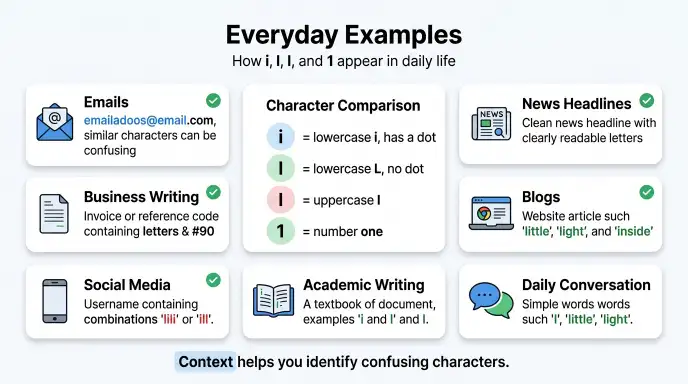
The i or l confusion can occur in many everyday situations.
Emails
Email addresses may contain several similar characters.
For example, an address containing li or il can be difficult to read in some fonts.
When entering an email address manually, check every character carefully.
Business Writing
Business documents often contain codes and reference numbers.
A clear typeface helps readers distinguish letters from numbers.
News Headlines
Most news websites use readable fonts, but decorative designs or small text can still make individual characters difficult to identify.
Blogs
Bloggers should use readable fonts for both desktop and mobile readers.
This is especially important when displaying:
- URLs
- Code
- Usernames
- Technical terms
- Product names
Social Media
Social media usernames can contain combinations such as:
- ili
- lil
- ill
- I1l
These combinations may look confusing in certain typefaces.
Academic Writing
Students and researchers may encounter this problem when writing technical terms, formulas, references, or computer-related information.
A clear font improves readability.
Daily Conversation
In ordinary reading, context usually makes the difference clear.
For example, a reader knows that light starts with l because the surrounding letters form a familiar English word.
Google Trends & Modern Usage
People searching for “i or l” are usually trying to identify a character rather than compare two English words.
The search can be connected to:
- Font identification
- Username confusion
- Password or code reading
- Website addresses
- Blurry screenshots
- Serial numbers
- Online account details
- Character recognition
Modern digital communication has increased this type of confusion because people frequently work with short strings of letters and numbers.
Exact search-volume or Google Trends statistics should not be assumed without checking current Google Trends data. General usage patterns suggest that the confusion is most relevant when characters appear without enough context.
The issue is also important in digital accessibility and interface design. A font that clearly separates similar characters can reduce reading and input errors.
Quick Comparison Table
| Version | Meaning | Correct? | Region | Example |
| i | Lowercase letter i | Yes | All English varieties | time |
| l | Lowercase letter L | Yes | All English varieties | light |
| I | Uppercase letter I | Yes | All English varieties | I am here. |
| 1 | Number one | Yes, when a number is intended | All | 21 |
The important difference is not correctness by itself. All four characters are valid, but they have different functions.
Key Takeaways
- i and l are two different letters.
- Lowercase i normally has a dot.
- Lowercase l normally has no dot.
- I is the uppercase form of i.
- 1 is the number one, not a letter.
- Font design can make these characters look similar.
- Context can help identify an unclear character.
- British and American English use these letters in the same basic way.
- Clear fonts are especially important for codes, usernames, URLs, and technical information.
- When accuracy matters, do not guess an unclear character.
FAQs
Q1. Is it an i or an l?
Look for the dot first. Lowercase i normally has a dot above it, while lowercase l usually has no dot. Context can provide another clue. For example, little contains both l and i, while light begins with l. If the font is unclear, compare the character with other letters in the same text.
Q2. How can I tell lowercase i from lowercase l?
The easiest method is to check for the dot. Lowercase i is written as i and normally has a dot. Lowercase l is written as l and normally has no dot. If the dot is difficult to see, look at the complete word and compare the character with other examples in the same font.
Q3. Is lowercase l the same as uppercase I?
No. Lowercase l and uppercase I are different forms. The lowercase l appears in words such as light, while uppercase I is used as the first-person pronoun in sentences such as I am ready. Some fonts make them look similar, so capitalization and context are useful clues.
Q4. Is i the same as the number 1?
No. Lowercase i is a letter, while 1 is the number one. They can look similar in certain fonts or digital displays. For example, i appears in fish, while 1 appears in 21. Always check the surrounding text when identifying an unclear character.
Q5. Why do i and l look the same?
Some fonts use simple vertical shapes for lowercase l and lowercase i. When the dot on i is very small, the two characters can become difficult to distinguish. Small text, blurry images, low screen resolution, and decorative fonts can make the problem worse.
Q6. What is the easiest way to remember i and l?
Remember one simple rule: i has a dot, l does not. This is the quickest visual clue. You can also use the surrounding word as a second check. If you are reading a code or username, compare the character with another known i or l in the same text.
Q7. Can a font make i and l difficult to distinguish?
Yes. Some fonts make lowercase l look like a simple vertical line, while lowercase i has a similar vertical body. If the text is small, the dot may be hard to see. For important information, choose fonts that clearly distinguish i, l, I, and 1.
Q8. Is there a difference between i and l in British and American English?
No. British and American English do not use different versions of these letters. The difference is mainly visual and depends on the font, capitalization, and context. Both varieties of English use i, l, and I according to standard spelling and grammar rules.
Q9. Why is i or l confusing in usernames?
Usernames often contain short combinations of letters and numbers without enough context to identify each character. A sequence such as lili, ill, or I1l can look confusing. Font choice can make the problem worse. When possible, copy the username directly instead of trying to guess individual characters.
Q10. How do I know if a character is i, l, I, or 1?
Check the dot, capitalization, shape, and context. i normally has a dot, l normally has no dot, I is uppercase, and 1 is a number. If the font is unclear, compare the character with other examples in the same text and use the surrounding word or code to confirm it.
Final Thoughts
The confusion between i or l is mainly a visual and typographic problem. Lowercase i normally has a dot, while lowercase l normally does not. Uppercase I is the capital form of the letter i, while 1 is the number one.
These characters are used differently even when they look similar. The word little, for example, contains both l and i, while light begins with l and inside begins with i.
There is no special British English versus American English difference that changes these characters. The main challenge comes from font design, small text, blurry images, and short strings such as usernames and codes.
For everyday writing, let the spelling of the word determine which character you need. For websites, business documents, usernames, codes, and technical content, use a clear font that makes similar characters easy to recognize.
The easiest rule to remember is simple: i has a dot, l does not, I is uppercase, and 1 is a number.
You May Also Like:

I’m Sloane Mercer, a U.S.-based English language writer focused on grammar, spelling, vocabulary, and everyday English usage. Through Wordvexa, I provide clear and practical explanations to help readers choose the right words and communicate with confidence.






4 thoughts on “i or I: When to Capitalize the Pronoun ‘I’ (With Examples)”